

Introduction
Standing in front of a wall of colour chips is harder than it looks. Everything seems perfect under the shop lights, but at home that soft grey turns blue by the window and muddy in the hallway. The best interior paint ideas start with the room itself: the light it receives, how you use it, and what already lives inside it.
This guide works through the house room by room, with colour directions, finish suggestions and lessons painters pick up on real jobs. Use it as a starting point, then adjust it to suit your home and your taste.
Start With the Light in Your Room
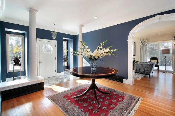
Before you save any interior paint ideas, look at how daylight moves through each space. Natural light changes paint more than any other factor. North-facing rooms in Melbourne get warm, steady light, which flatters most colours but can make cool greys look flat. South-facing rooms receive cooler, bluer light, so a white with a hint of warmth stops them feeling cold. East-facing rooms glow in the morning and go quiet by afternoon, while west-facing rooms turn golden at the end of the day.
Artificial light matters too. Warm globes pull colours towards yellow, and cool white LEDs push them towards blue. View your sample in the morning, at midday and in the evening, under the lights you actually use, before you decide.
Build a Palette Before Choosing Colours
Choosing interior house colours one room at a time is how homes end up feeling disjointed. A better approach is to settle on a small palette for the whole house: two or three main wall colours, one white for ceilings and trims, and perhaps one deeper accent. Rooms that open onto each other should share an undertone, even when the shades differ.
Think about what stays fixed, too. Floorboards, benchtops, tiles and window frames all have undertones, and your walls need to suit them. A cream floor tile clashes with a cool grey wall, while a warm greige sits comfortably beside it. Good interior paint ideas match the colour to the materials already in the home.
Living Room: Calm, Flexible and Easy to Live With
The living room has to work for everyone in every season. Safe interior paint ideas for this space start with a soft, grounded base. Warm whites, light stone and gentle greige let furniture and art stand out. If you want more personality, muted greens and dusty blues bring in a natural feel without being loud.
For a cosier room, try a deeper tone such as olive, charcoal-blue or warm taupe on all four walls rather than one feature wall. Painted evenly, a dark colour feels intentional and surrounds the room. A low-sheen finish is forgiving, hiding small marks and minor surface flaws. Many popular interior decorating ideas rely on this approach: one confident colour, simple furniture and good lighting.
Kitchen: Fresh, Clean and Easy to Wipe
Kitchens take steam, splashes and fingerprints, so the finish matters as much as the colour. When shortlisting interior paint ideas for a kitchen, put durability first. A wipeable satin or semi-gloss finish copes with daily wear far better than flat paint. For colour, crisp whites feel clean, while soft sage, pale blue-grey and warm cream add character without overwhelming the space.
If your cabinets are already a strong colour, keep the walls quiet. If the cabinets are plain, the walls are a chance to add warmth. Small kitchens usually benefit from lighter shades that bounce light around, although a deep colour on one end wall can add depth if the room is well lit.
Dining Room: Set the Mood for Long Dinners
Dining rooms are used mostly in the evening under warm light, which suits richer colours. Deep green, terracotta, eggplant and inky navy all look beautiful by lamplight. If you prefer something lighter, a warm off-white or pale clay keeps the room welcoming. Painting the ceiling a lighter tint of the wall colour gives a soft, enclosed feel.
Bedroom: Colours for Better Rest
A bedroom should be the place where your shoulders drop. Soft, low-contrast colours work best: misty blue, pale sage, warm sand, muted lilac and greys with a touch of warmth. When collecting bedroom wall colour ideas, look for shades with a slightly grey or earthy base, because very bright colours feel energetic rather than restful.
Dark bedrooms can also be lovely. A deep navy or forest green wraps a room like a cocoon, particularly when natural light is limited. Dark interior paint ideas work best when you commit to the whole space, ceiling included, so the colour feels deliberate. Keep the finish matt or low sheen so reading lights do not create glare.
Kids’ Rooms: Room to Grow
Children’s tastes change quickly, so choose a flexible base and let bedding, posters and toys add the fun. Soft blues, warm greys, pale greens and creamy yellows suit most ages. Choose a scrubbable finish, because kids’ walls collect fingerprints, crayon and the occasional flying toy. One playful feature, such as a painted arch or a colour block, is easy to repaint when they outgrow it.
Bathrooms and Laundries: Moisture Comes First
The best interior paint ideas for wet areas begin with the product, not the shade. Steam is the main enemy. Use a paint made for wet areas and make sure the room is well ventilated, otherwise even the best paint will eventually show mould. Light shades such as soft white, pale aqua, warm grey and light sand keep small spaces feeling open. In a compact laundry, a fresh wall colour with white cabinetry feels bright and tidy. Satin or semi-gloss finishes wipe clean easily and resist moisture better than flat paint.
Hallways, Stairs and Entries
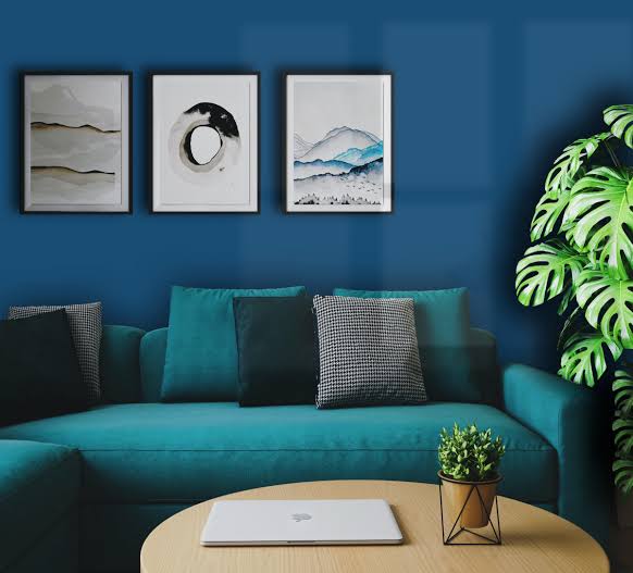
Hallways are often forgotten, yet they link every other room. When you review indoor wall colour ideas for the whole house, this is the space that ties everything together. Choose a colour that sits comfortably between the shades on either side, usually a lighter or more neutral version of your main palette. Because narrow spaces show every scuff, a washable low-sheen finish is a smart choice. If the hallway gets little daylight, warm whites and soft creams stop it feeling like a tunnel.
Home Office: Focus Without the Flatness
A workspace should help you concentrate, not send you to sleep. Muted greens, soft blues and warm neutrals are easy on the eyes during long days. Avoid stark white if you work in front of a screen, since it can feel harsh. If the room is also your video-call backdrop, a mid-tone wall behind the desk looks more polished on camera than bright white.
Using Accent Colours Without Overdoing It
An accent does not have to be a single feature wall. Try painting a door, an alcove, the inside of a bookshelf or the back of a built-in cabinet in a deeper shade. These small changes add depth and let you try bold interior paint ideas without committing a whole room. Stick to one accent per room, and repeat it lightly elsewhere, such as in a cushion, a vase or artwork, so it feels connected rather than random.
Small Rooms and Open-Plan Spaces
Small rooms do not have to be painted white to feel bigger. Pale, warm shades reflect light well, and painting the walls and ceiling in closely related tones blurs the edges of the room. In open-plan homes, the challenge is flow. Use one base colour across the shared area and let furniture, rugs and lighting mark out each zone. If you want to define a dining or study corner, a slightly deeper shade of the same colour does the job without breaking the continuity of the space.
Choosing Finishes for Walls, Ceilings and Trims
Finish changes how a colour looks as much as the shade itself. As a rough guide:
- Matt: hides wall imperfections and gives a soft look; best for ceilings, bedrooms and lounges.
- Low sheen: a good all-rounder for living areas and hallways.
- Satin: tougher and easier to clean; suits kitchens, kids’ rooms and bathrooms.
- Semi-gloss: highly durable; best for trims, doors and window frames.
Ceilings are usually white or a lighter tint of the wall colour. Trims in a slightly warmer white than the ceiling look softer against coloured walls. For a modern look, painting skirtings and doors the same colour as the walls creates a seamless, calm effect.
Test Before You Commit
Even good interior paint ideas can fall flat if the colour is never tested at home. Paint a large sample, at least A3 size, on two different walls and leave it for a few days. Sample pots on a piece of board also work well, because you can move them around the room. Colours that look bright on a screen or in a shop can feel very different on your walls, so trust the sample, not the chip. If you are torn between two shades, choose the one that looks better on a grey, overcast day. If it works then, it will work at any time.
Common Mistakes to Avoid
Even the best house colour ideas can disappoint when the basics are skipped. The most common slip is choosing a colour in the shop and never checking it at home. Another is ignoring the undertones in floors and benchtops, which makes walls look off no matter how nice the shade is. Using one colour in every room flattens a house, and skipping preparation is the fastest route to a patchy result. Cracks, stains and old glossy surfaces all need attention before the first coat goes on. Many interior painting ideas look great on a mood board but fall apart in practice because of rushed coats and poor preparation.
FAQs
What colour makes a small room look bigger?
Light, soft colours such as warm white, pale grey or light blue reflect more light and help a room feel more open. Painting the ceiling a similar shade also helps.
What is the best paint finish for interior walls?
Matt or low sheen suits living rooms and bedrooms. Satin or semi-gloss is better for kitchens, bathrooms, and woodwork.
How do I choose a colour scheme for the whole house?
Pick one main neutral for connecting spaces, add two or three supporting colours for individual rooms, and keep trims consistent.
Should I paint an accent wall?
It’s a great way to add colour with little commitment. Choose a wall that naturally draws the eye, such as behind a bed or sofa.
How often should interior walls be repainted?
It depends on the room and how much it’s used, but high-traffic areas like hallways and kitchens often need attention sooner than bedrooms.
Conclusion
Choosing colour is easier when you work with the room instead of against it. Start with the light, build a palette that flows, pick finishes that suit how each space is used, and test every shade before committing. With these interior paint ideas, you can move through your home with confidence, whether you are refreshing one space or the whole house.
If you would like help with colour selection or a clean, lasting finish, Sam Simon Painters offers colour consulting and professional interior painting across Melbourne.Get in touch to discuss your project and find the right colours and finishes for your home.